 The K-pop world is not unfamiliar with boy groups and ballads. However, it might come as a surprise that the new MV release for 100%, “Sketch U,” falls within such a category. Past releases by the boy band have been characterised by the concepts of masculinity adopted. They embodied the boy band vibes of 2010 — a vibe well-represented by groups such as BEAST and MBLAQ. Perhaps opting for change, “Sketch U” is definitely a ballad song that falls out of place with grungier tunes and the powerful choreography of the past.
The pastel overtones and dimly lit sets of the MV brings to mind certain melancholy, while definitely delivering a certain aesthetic pleasure as well. The song speaks of a lost love, with the male protagonist of the MV reminiscing memories of his lover. He sees her occupying the spaces of his life, now left empty because of her absence. He is left incomplete, a void now consuming his life:
I can’t go anywhere, just keep standing here and getting spacing out
I hope you’re back again in this empty room
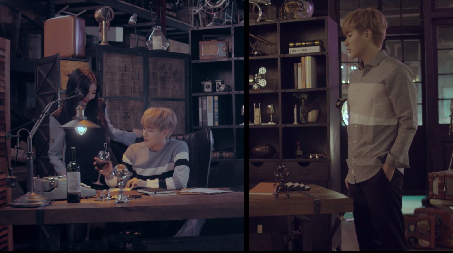
The MV puts into the play the technique of split screen to amplify the difference between a better past and the current state of despair. Such a trick is brilliantly employed in Sejeong’s “Flower Path” in juxtaposing the past and present — the sense of a familiarity with a place and memory, yet the acute sense of a difference.
The MV for “Sketch U” attempts to achieve the same sense of melancholy at an irreversible passage of time and change. However, “Sketch U” fails at evoking the same level of emotional intensity as it would have desired. The use of a split screen works at certain instances, with the shot of the present slowly fading into the screen. This draws out the sadness of reminiscing a lost relationship and irretrievable happiness.
The split screen also works in cases of drawing parallels between both the male and female protagonist, with a background that is similar and only having the human figures be the point of difference within the shot. The background then becomes a point of reference for detecting the stark differences between both screens, eliciting the sense of loss that makes such a technique aesthetically successful.
However, I feel that “Sketch U” fails at achieving its desired effect because of less nuanced handling of the split screen. At certain moments, the shots in each side of the split screen seem to be at odds with each other, disrupting the sense of unity that is necessary for the technique to work. There are close-ups of the protagonists, making the split screens uncomfortable and unnecessary. Both sides of the split screen are imbalanced, with the distance of the close-ups being different and the images fall out of parallel with each other. The movements on both side of the screen are inconsistent as well at times — I do find myself slightly thrown off watching.
At times, the split screen is used to amplify the loneliness of both the male and female. Though they occupy the same screen of the MV, they are very explicitly segregated and distanced from each other. They occupy two separate realities and two separate sides of the split screen. Yet, as previously mentioned, the split screen is also employed to manifest a past memory located in the same location that the protagonist is occupying in the present. It is a juxtaposition of the past against the present. Rather than codifying the split screen with a single meaning, the complexity in the use of the split screens might have added to the sense of fragmentation with regards to this particular MV.
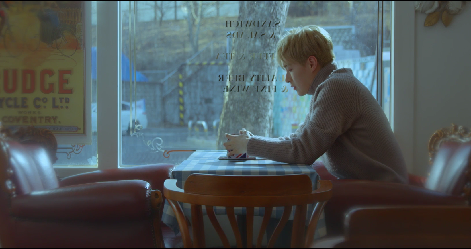
 Rather, I appreciate the simplicity of one-shot scenes compared to the split screens in general for the MV. The shot of him sitting in the café, sipping at a cup of coffee alone, felt poignant enough to draw out a sense of melancholy. The empty seat opposite him is already symbolic of his loneliness, without needing complex editing techniques. A simple medium shot without variation, cast in the soft blue lighting that makes one think of solitude is sufficient.
The beginning of the MV tied really well with its second to last scene, both being shot by the river and coated in the typical soft lighting and pastel colours. I did notice that the colours of clothing were kept consistent, in pastel pink and white/grey, varying only in style. The parallel was clearly made in my mind, recalling the notion that such links can be made without overt techniques.
Admittedly, 100% does not disappoint in its vocals. Musically, the song was indeed pleasing and satisfying to listen to. I was especially struck by the lyrics:
I think if I follow this road I’ll see you
So I just walk
There is a certain poignancy that shines through, especially with the emotionally charged vocals delivering them. The sense of helplessness and blind determination really shines through, reaching out to a feeling that we might all have stumbled and struggled through at some point in our lives.
Standing alone as a song about lost love and the futility of reminiscing a past relationship, “Sketch U” works really well. Yet, the aesthetics of simplicity are fragmented by the unstable employment of the split screens. Perhaps it was an attempt to incorporate too many brilliant things at once that made the MV hard to fully digest on an emotional level. It was hard to focus on the MV, with its complex shuffling between filming and editing techniques while listening to the song and needing to be immersed in it. Holistically speaking, “Sketch U” as an MV falls short of the emotional intensity of the song itself.
MV Rating: 3.8/5


