In this day and age where most of us tend to get our music in digital form, legally or otherwise, buying physical albums have largely become a thing of the past.
However, a case could still be made for getting our K-pop fixes on a CD. Firstly, as an international fan without a Korean music site account, one of the few ways of registering our support for favoured acts would be to buy a physical copy of the album.
Secondly, there could also be a case made for listening to albums on CD, given that it sounds slightly more detailed, especially when played on a quality sound system. For one, it becomes easier to tell the positions the singers are standing at in the recording studio, as well as the softer instruments used in the mix.
Also, some companies (looking at SM Entertainment) use the physical format to package in some extra “collectible items” like posters or photo cards, with the latter being especially able to bring the inner obsessive collector in fans.
But most importantly, the reason for buying a physical copy of a favourite album has got to be for the packaging, as well as how creative companies can get to make their albums stand out in the music stores.
With that, it’s worth taking a look at how some albums are packaged and designed.
The packaging:

The jewel case or DVD sized box has largely fallen out of favour in K-pop. Over the last two years of purchasing albums, the only one I have that is packaged in such a standard form is SNSD’s Run Devil Run. Packaged like a DVD and with a silhouetted figure for the cover, it now appears like one of the less imaginative album designs over time.
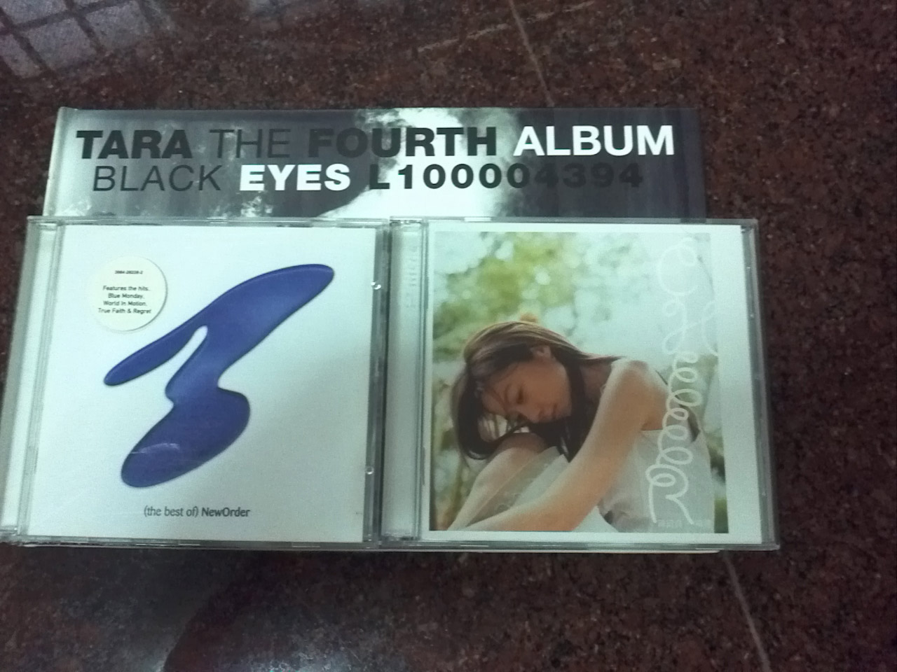
The trend these days is largely toward albums made out of hard cover boards, and of varying sizes such that some of them struggle to fit in a typical CD shelf. A good example would be T-ara’s Black Eyes release which is almost twice the size of a typical CD jewel case, and a fair bit taller to boot.
Even when albums appear to conform to a size (slightly larger than a DVD case), there are still slight differences here and there. Stacking F(x)’s Hot Summer on top of the Wonder Girls’ Wonder World, the F(x) release is slightly taller, though the Wonder Girls “fights back” by being a bit wider.


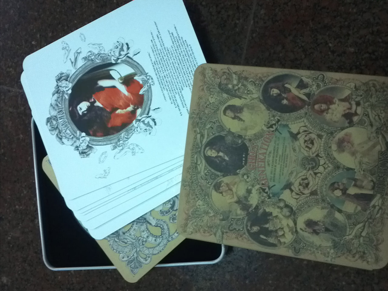
Then there is packaging which simply defies most convention, in the case of SNSD’s The Boys, which comes in the form of a metal tin between the size of a CD jewel box and DVD case, or their latest TTS release, which features a cardboard box sliding out to reveal the concept photos (in the form of separate cards) and the CD.

And there are special edition repackages, as shown by the Brown Eyed Girls Sixth Sense repackage, which came in a purple box with a velvet styled-covering.

The album art:
As much as most K-pop album releases struggle to conform to a size, there is a good reason for doing so. A slightly odder album size seems to stand out on the shelf, as well as affording more creative freedom to the people tasked with designing the album covers.
The result of this lack of conformity are some albums which move away from the usual “members posing in a group for the album cover”, ranging from this retro movie inspired cover for T-ara’s John Travolta Wannabe:

To the butterfly-like pattern on Secret’s Moving in Secret, which was nice.

And to the minimal, stylised legs in an A formation, that could only be a Miss A trademark.

The photo book:
Of course, one of the added benefits of a physical copy is the photo book, containing some pretty shots of the artistes that aim to explain the concept, as well as liner notes crediting those who directed the album and some messages of thanks from the artistes.
While most photo books tend to be glued or stapled to the album packaging itself, as shown above, the Brown Eyed Girls break nicely with tradition by making the photo book detachable from the album packaging, making it far easier to flip through.

And again SM has moved away from the usual, going with separate photos placed in a folder for the photo book, as shown with The Boys album.
Getting to The CDs:
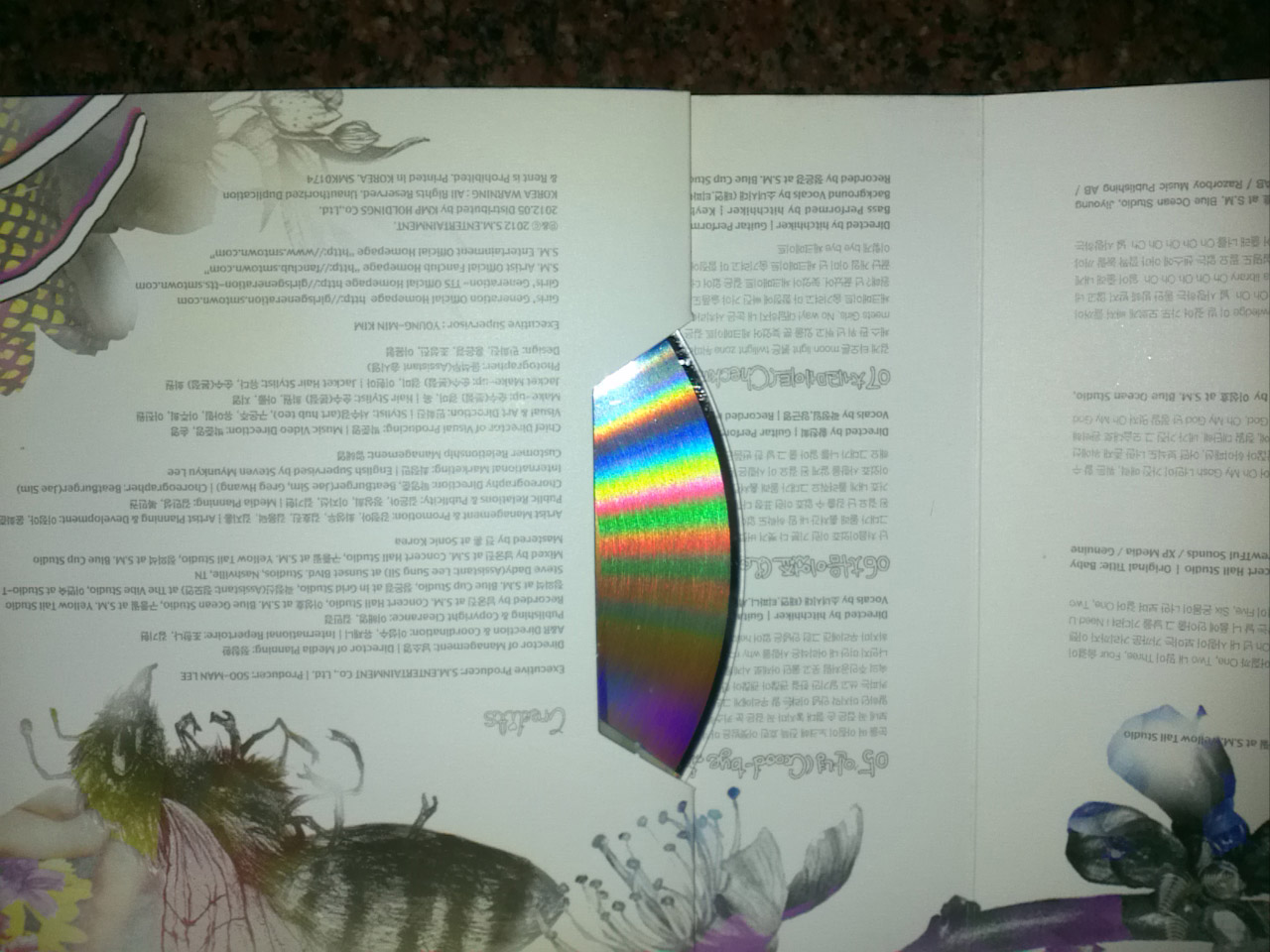
Of course, the main reason for buying the physical copy is for a pristine CD, perfect for home listening. These days, most CDs tend to be held in by a foam button (left), which tends to get deformed or dented after a while.


Far more preferable are the plastic holders (right), which stand up better to the CDs being repeatedly taken in and out.
A design that looks good but does not hold the CD in place well is SNSD-TTS’s Twinkle. It is far too easy to drop the CD out of the paper packaging that holds it in place, unless it is placed at an angle.
Other interesting details observed:
This clever use of the album cover never fails to make me smile a bit.


A printing error perhaps?
Hands down, the winner for top use of Kongrish.

So Seoulmates, do you enjoy the little details that make up physical albums? Or have you already moved on to the digital formats?
(photos courtesy of author)