 It doesn’t feel like much time has passed since the last release by Monsta X. They’ve been working hard since their pre-debut No Mercy days (not a B.A.P reference). They’re one of those groups that might not be on everyone’s radar, but they are steadily gravitating towards making bigger blips on some maps. Naturally, this process involves a few growing pains, and the most common one that many groups endure in the beginning is cementing their identity.
With a plethora of idol groups in k-pop, it’s beyond difficult to stand out unless they have something significantly special. Talent is key, but so is public appeal. That’s why companies will throw just about anything out there, and Starship Entertainment is guilty of playing to the status quo with Monsta X. It shouldn’t matter if I’m a Monbebe or not because that’s not the main issue. My biggest gripe with Starship — and most agencies, in general — is they can’t see the forest for the trees many times. These companies are desperate enough to follow anything currently trending, and that’s a problem for newer groups seeking a larger and more solid fan base. They should focus more on elevating the content they put out instead of trying to please a fickle public.
As a result of this lack of confidence in their artists’ appeal, we don’t always get concepts that serve their music well. “Fighter” is very much on the nose with its lyrics about fighting for love, yet the MV becomes convoluted with too many ideas that don’t contribute to this theme. It’s quite unfortunate since the song could’ve been served better with a more cohesive video.
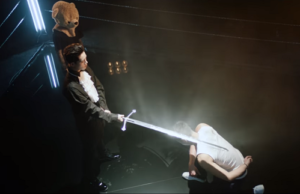
The video starts with Shownu‘s back as he punches a wall. A part of me wishes this scene was a tongue-in-cheek reference to how hard it is to break through the metaphorical wall of obscurity because that would be brilliant. However, this isn’t the case. This is eye candy, and we get a lot more of it as the video continues. If you need proof, look no further than Wonho‘s nearly topless wielding scene.
To be clear, there is nothing wrong with eye candy. It serves its purpose of making fans lose it over their biases. It’s fairly clean and harmless fun. I’m not looking for anything with deep meaning in this video; however, that’s where I think the director went south in executing his ideas.
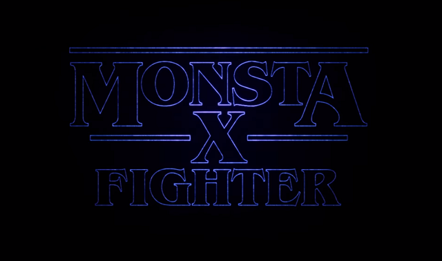
There are a LOT of ideas at play here, perhaps too many. Fans felt the title card was a reference to the Netflix show Stranger Things, but being a child of the ’80s, I vaguely recall seeing this typography from the past. It was sort of a trend back then, so it’s cool to see such a throwback to that period. Some elements, like the wielding and fight scenes, had me thinking this was a nod to the Rocky-type movies where the protagonists had some kind of moral-boosting montage that demonstrated growth of the main characters. Too bad that progress was interrupted by scenes that derailed that train of thought.
 Why is Jooheon — looking like the host from The Iron Chef — knighting Shownu inside of a boxing ring as two people in teddy bear heads flank him? What was in that bloody bag that Kihyun had? And who kidnapped him? What’s up with that odd computer Monsta X had to power up? What are the members doing in a hospital, and does their escape symbolize some greater message that I’m missing? There was also a nod to The Matrix, which felt out of place, with gummie bears replacing the proverbial blue and red pills.
I’m expecting a lot of Monbebes to copy and paste a few paragraphs of theories about what is going on, and that’s lovely. It still doesn’t excuse what appears to be a bunch of ideas that were sloppily thrown together because the director simply thought it would look cool, and Monsta X’s fans wouldn’t care. If he only wanted to turn the members into eye candy, then he could’ve accomplished this task in so many ways without confusing the audience. Did he forget that “All In” is the predecessor to this? How is this a continuation of the story line?
All problems aside, I did enjoy the inserts with Shownu’s dancing. That never grows old, but a group dance sequence would’ve been preferable. I wasn’t mad at the rapping sequence between I.M and Jooheon, either. They work well together and may want to consider a sub-unit. The members look really good, so cheers to the stylists for that. I’m struggling for good things to say, but compared to their last video, this came off like an amateur mess. If this was their debut video, I’d brush it off as a learning experience, but Monsta X has been out too long to be given rookie rubbish.
Even if this video was meant to be an homage to ’80s movies about underdog fighters working their way to the top, it still fell short, especially at the end. Those close-ups of the members in front of a cheap-looking sky background was probably the worst part of this. Unless the director meant to cheekily nod towards the cheesy nature of ’80s MVs, I’m thinking a lack of time (and possibly money) lead to this faux pas with terrible lighting. It would’ve taken nothing to go outside and film the members against the setting of a real sky under the flattering gaze of the sun (see “Hero” rooftop version). It might be a tiny detail that means nothing to some people, but I’m arguing for consistency in quality here. Doesn’t Monsta X deserve that?
Starship needs to step up their game next time, or this group risks blending with every other idol group.
MV rating: 3/5
(YouTube, Images via Starship Entertainment)


