Some of the most common complaints of K-pop fans would run along the lines of “oh gosh, oppa’s hair is absolutely awful in this shot” and “oh look, they’re dancing in a box again.” Indeed, many of a K-pop fan’s pet hates and bouts of second-hand embarrassments are consequences of music videos — videos that do not meet one’s preferences or expectations; videos that despite having generous solo shots of your bias, fail to be engaging and impressive. There used to be a time when a slick set and perfect in-sync dancing was new and exciting. But now, when it’s idol group after idol group stepping on stage, the creative staff behind the stars’ music videos need to start stepping it up.
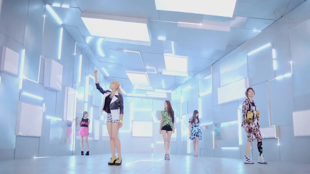 Yes, while the typical dance-and-solo-shots set-up of it might seem like a good idea, especially when one has an imperative to sell not only the song but also the individual members and their dancing ability. This need increases with an increasingly saturated idol market with groups striving to set themselves apart. A music video plays a key role in this situation, considering that it may as well be the first glimpse somebody will get of the group. Every single new release is an opportunity (not just to sell) but also attract new members for a fanclub. However, three sets, biased solo shots and three costume changes is not quite enough to sell a group to a person. Especially not if they expect more than some seen-before eye-candy every comeback. Of course, while it would be refreshing to see an artist carry out a solid plot in a music video, the possibilities of that going horribly wrong is also entirely possible. While T-Ara‘s 12-minute long epics were indeed enjoyable to watch (Jiyeon in black leather and short hair? And a gun? Approve.), those plot holes really need to be plugged. There are many aspects which come together to put together a music video, but the unavoidable part of one is the set. Yes, that’s f(x) dancing in a fancy box. And yes, that’s U-KISS in an obscure, ruined room again.
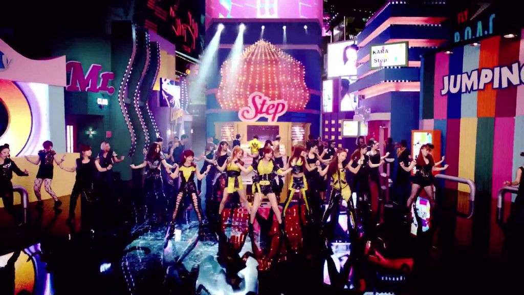 While many fans have a great dislike for the oh-so-boring box sets which run rampant in K-pop, there are also a select few mention-able ones. The shiniest, slickest and classiest boxes. Indeed, f(x)’s latest purple box is quite a treat for the eyes, complete with flickering fluorescent lights to channel that ‘electric’ feel. KARA though, who really doesn’t impress with music videos for the most part, had quite the impressive set for “Step”. While it’s easy and fair to say that their blue themed set wasn’t the best for it was possibly a tad too busy and clashed with the girls’ costuming, the overall effect of all three (though, technically four) sets in the music video made quite the impact. “Step”‘s music video was a kaleidoscope of colour, and to be fair, a highly enjoyable one in terms of eye-candy. The white set was boring, yes, but the five microphone stands which had been incorporated into the choreography made it work like nothing else could. The colour block corrugated iron background where the girls had individual shots in front of was a clever choice, for solid colours are (if chosen correctly) generally pleasing to the eye and not very blinding. In terms of set ‘architecture’, “Step” was blessed to have a very large box. While the sets were designed to resemble a technicolour street, with wide, high camera angles to create a sense of size, taking a closer look, it’s really just a huge, sparkly box. With KARA’s discography stamped on various ‘buildings’. Best colourful set done right goes to KARA, this writer thinks.
Indeed, what KARA has shown us is that a set cannot work alone. There is a necessity for more than one set, especially if the only shots your video will consist of are dancing shots. MBLAQ does this well in “Cry”, a ballad, complete with its fair share of floor-wiping choreography. The main black set isn’t anything special, K-pop has done its rounds with its black sets, all varying in design — circles, triangles, we’ve seen it all — but “Cry” has a bonus of roving lighting and camerawork. The brown set had a more obvious manipulation of the lights, with them being turned off in a circular motion, giving the shot a somewhat eerie pulsing effect. The individual shots were also blessed with what appeared to be cloth walls, with a wind machine causing them to move. It was a curious effect, but it worked well and gave the scene a feeling of instability. The rain which came pouring down at the climax of the video was also a nice touch (hopefully they were reusing the giant pool of water the boys were in) and definitely got the fangirls ecstatic.
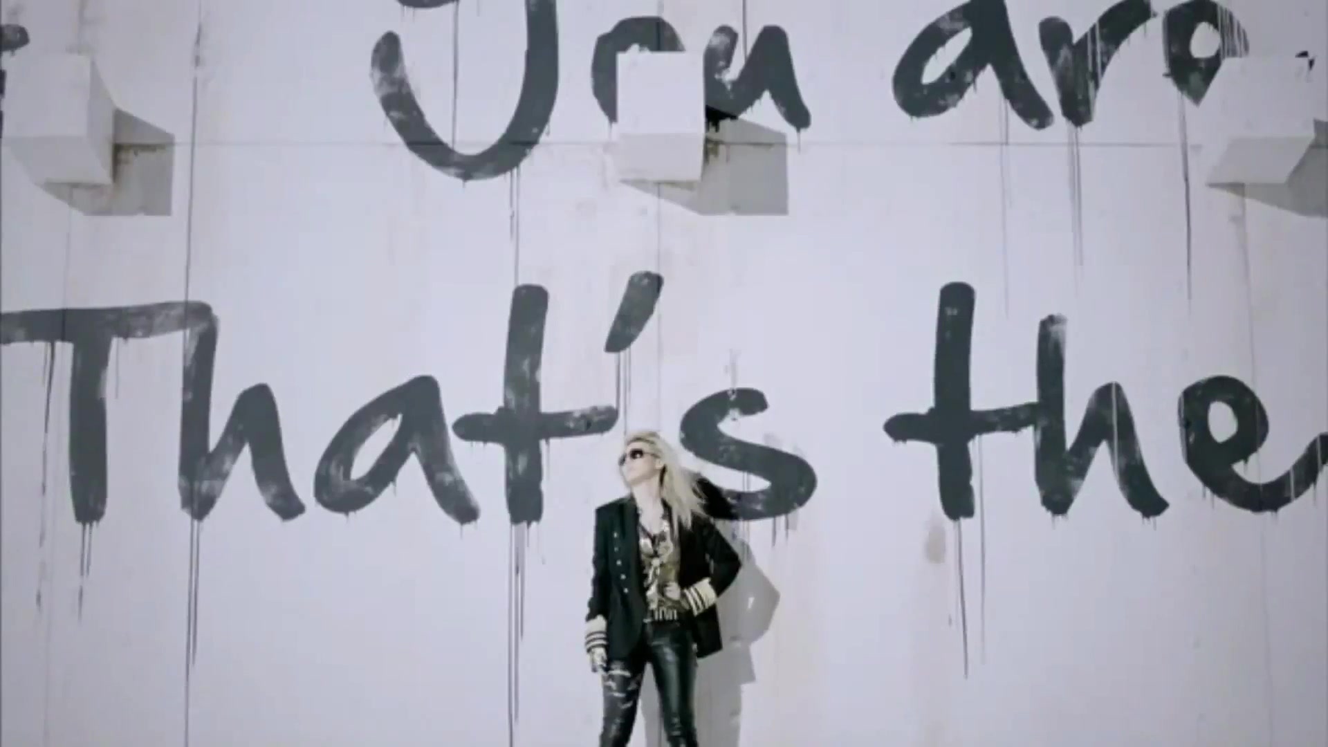
Personally, despite my inability to fully appreciate all of YG‘s music, my heart goes out to them when it comes to visuals. YG knows how to push the boundaries with … well, anything really, and that includes sets. 2NE1 in particular, seems to have gotten some of the more exciting boxes (but in all fairness, YG uses boxes less than our largest perpetrator, SM). Indeed, “Clap Your Hands” had some of the more curious sets in the entire 2NE1 collection, jumping from grungy street-style to a curious adaptation of your well-known oriental room before ending with a YG jungle. In theory, such drastic transitions should be jarring and lose the original aim of the video. However, 2NE1 manages to pull it all together with a curious fuidity. Furthermore, while not necessarily a YG production, the Japanese PV for “Lonely” had me singing its praises. The set was largely white, but devoid of the typical lights and glowing strips audiences have become well-accustomed to within the K-pop-sphere. There were no polished floors, instead, we had snow falling on a white could-be-city-wasteland and what appeared to be comprehend-able English painted across white walls.
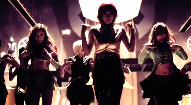 Most boxes will look like boxes, but some, like Sunny Hill‘s in “The Grasshopper Song” push the boundaries and reveal the possibilities that sets really have. Tell us, Seoulmates, do you have a favourite box?
(DSP Media, sokayi2000, 2NE1, SM Entertainment, Loen Entertainment)
