Welcome back to another instalment of For Your Viewing Pleasure, where we take time out of the week to curate a set of photos from the K-pop landscape.
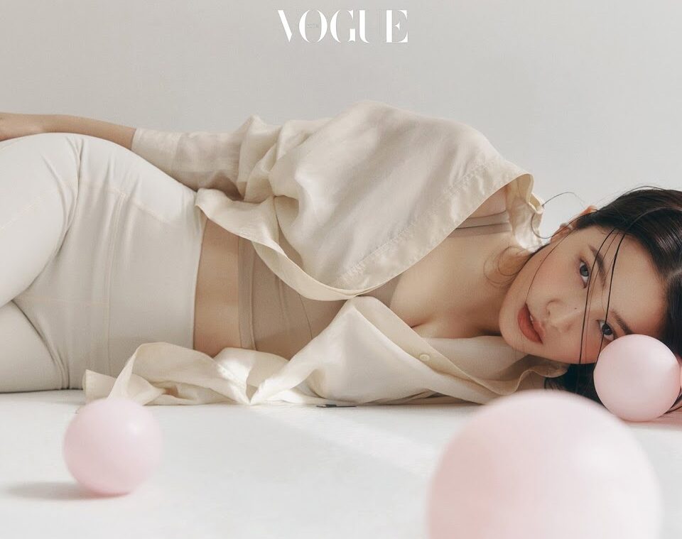
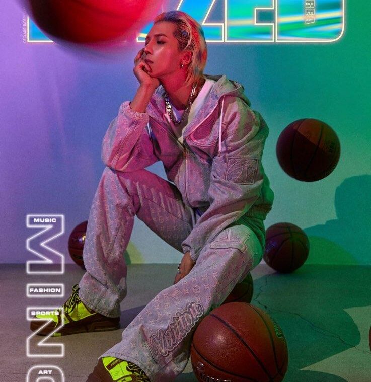
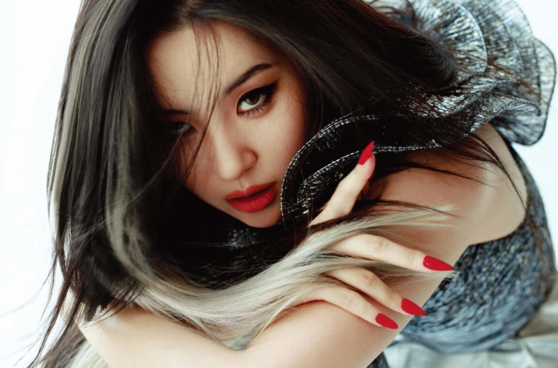
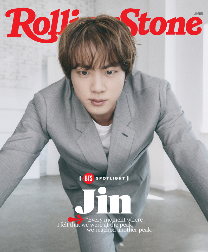
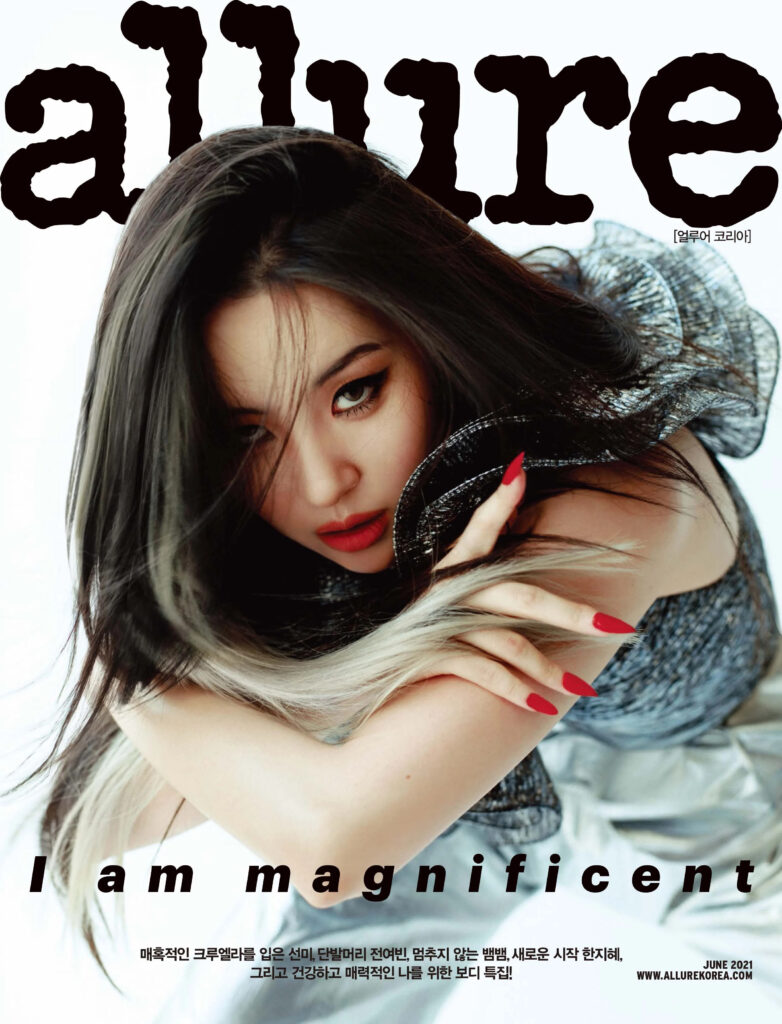
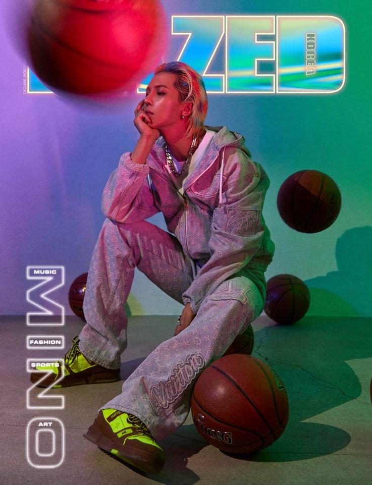
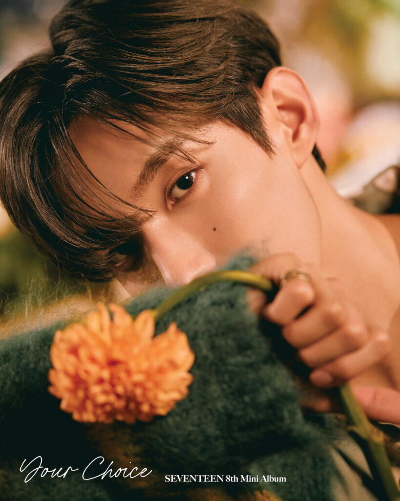
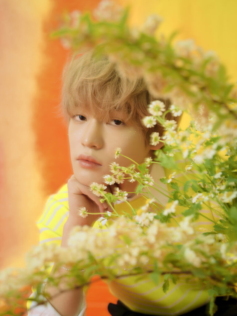
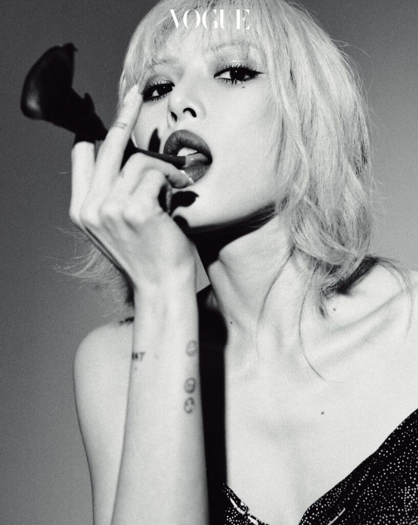
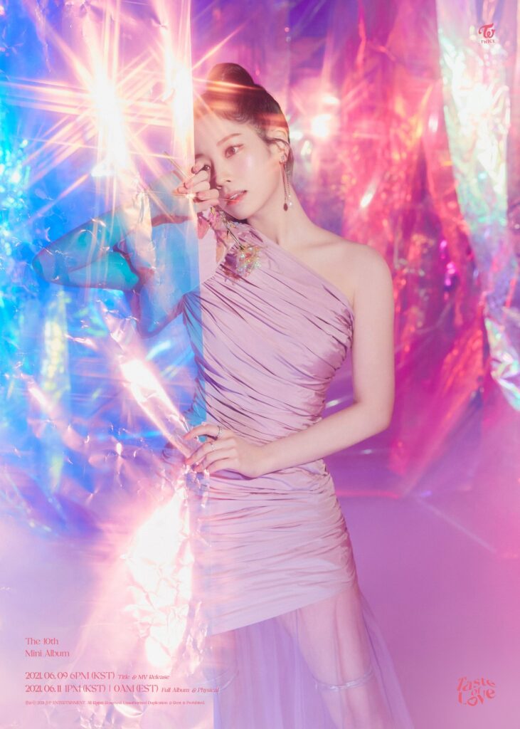
Layers of perspectives in magazine pictorials gives them more depth than what just a simple headshot may achieve. By twiddling with the foreground and the background, fashion photographs emerge as multilayered landscapes that play with our vision. The pink globes in focus before Yeri or the flowers in front of Chenle keep the viewer engaged by intentionally making one’s eyes skim over the breadth of the photograph. The use of the foreground can make the subject of the pictorials also stand out more as Dahyun does in recent TWICE teasers. Take a look at the following photographs to see how perspectives shift with the foreground:
(Images via Allure, Dazed, Rolling Stone, Vogue, JYP Entertainment, SM Entertainment, HYBE, and Brave Entertainment)
