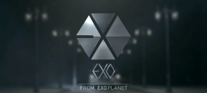
 It is always interesting to watch how a rookie group will be marketed by their label, and this year’s debuts are no exception. 2012’s rookies have introduced some innovative marketing techniques and concepts, from EXO’s multiple teasers and magical powers theme to B.A.P’s multiple comebacks and Matoki mascot, to Cross Gene’s multinational members representing various desirable “genes” from each of the East Asian countries. What is interesting to note is that all these diverse attempts at establishing a signature image have shared a common tool: an artsy logo. While logos aren’t new to K-pop, the increase in their sophistication signifies a newer focus on brand-building in the industry. With this in mind, let’s take a look at the various types of logos and the way they are promoted through K-pop.
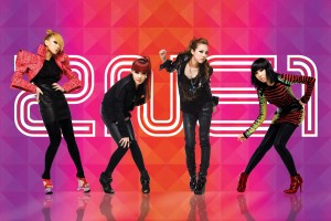 The most common type of logos in K-pop are the text logos which simply display the artist name in some unique typeface. Such logos are pretty much standard especially pre-2010, and are used by bands such as Big Bang, 2NE1, B2ST, U-KISS, MBLAQ, ZE:A, Teen Top, B1A4, T-ara, JYJ, the list goes on and on. The less common type of logos in K-pop are symbol logos. This has definitely been the year of more symbol-like logos as seen through B.A.P’s bunny, EXO’s hexagon, and VIXX’s robot, as well as BtoB’s winged logo and Cross Gene’s crystalline gene-shaped logo. Symbol logos have also appeared before 2012 such as Infinite’s clever usage of the infinite sign, After School’s crest, and GD&TOP’s bunny that was eventually changed due to its resemblance to the playboy bunny.
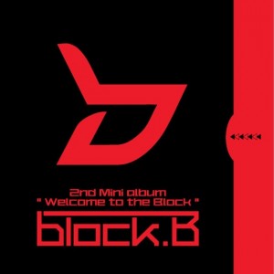 Some bands have also used a combination of text and symbol logos as their trademark. For example, 4Minute displays its name in the shape of a four, and Block B has both a noticeable typeface and a symbol on all its albums. And some bands just don’t use logos at all, such as most SM artists. While I have seen certain logos floating around on merchandise (that I’m not even sure is official), the stylization of SM band names like Super Junior, SHINee, F(x), and Girls’ Generation constantly changes, with EXO being the first band to have a concrete symbol logo.
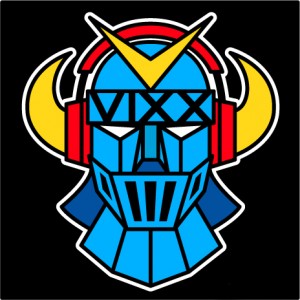 As symbol logos are a lot more visually unique than text logos, they are more likely to stand out in your mind especially when promoted in memorable ways. In B.A.P’s case, the logo was actually brought to life in “Warrior” via the mysterious guy with the bunny head, whom we later found out represented B.A.P’s official mascot, the Matoki. EXO’s logo was displayed at the end of every single teaser and was accompanied with a machine-like sound that became an icon in and of itself after hearing it a billion times.
And VIXX actually wore shirts with their robot logo on them in their music video for “Super Hero”, while Cross Gene incorporated its logo into the scenery of its music video “La-Di-Da-Di” via gene-shaped window panes, and every single one of Cross Gene’s promotional videos on their Youtube channel features their logo in the beginning. All of these techniques are a lot more clever then the traditional flashing of the logo at the beginning and/or end of music videos, seeming to indicate a new style of brand-building that involves more than just stamping your name on CDs and merchandise.
What do you think? Have you guys picked up on the variation in K-pop logos? What are some of your favorites?
