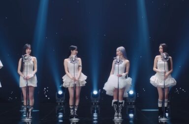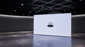
With their March 2021 rebranding as the “lifestyle platform” Hybe, formerly named Big Hit, seemed to be taking their dominance in K-pop to the next level. Through subsidiaries and collaborations with companies from YG to Naver, Pledis to Universal, this is a company whose reach is only extending ever further into more and more fields. What better step to follow announcements about virtual concert platforms and the first US-based K-pop survival show than an exhibition? Or better yet, virtually a whole museum? This is the latest of Hybe’s feats: their cultural museum/exhibition space, Insight.
Billed as offering a “holistic, stimulating experience consisting of sound, movement, and story”, Hybe Insight promises to demonstrate the power of music through the five senses. An intriguing prospect (smelling music? OK then), the exhibition certainly manages to deliver on its sensory promises. Whether the power of music really comes through is less certain, though the success of using the senses ends up providing an experience that doesn’t necessarily need any of it.
I won’t hesitate to admit that I, along with a probable majority of attendees, wanted to visit Insight because of BTS. As the jewel in Hybe’s crown, they were undoubtedly going to be featured heavily, and the chance to see visual art of my favourite K-pop group was all I was really hoping for. This would be my first chance to see a BTS-related exhibition, though there had been others in the past. Given the standing that Hybe now has in the music industry, I could guess at a level of smoothness in the exhibition’s production. However, there was a slight concern that this same smoothness could give way to corporate blandness, or even showiness.
I was not wrong about the smoothness of the operation, though perhaps a little cynical in thinking it would be bland. Attendees are given a specific time slot in which to experience the museum, and while this itself is standard, the level of organisation is not. The exhibition is run diligently by guides who gather each group (defined by the colour of tote bag you are given), introduce every section, and outline the rules and general flow of movement for each area. Whilst these guides are notably enthusiastic, this initially seemed a little restrictive. You mean I have to follow this guy and not wander off looking at any display for too long? Wouldn’t it be better to let us all just roam free?
But this is not, and realistically could not be, the case. With a company as popular as Hybe, anything less than this level of organisation would likely result in crowds of fans around specific items or areas, with phones beaming in every direction and little attempt at understanding the space’s overall curation ideas. Aside from this pragmatic reasoning, the organisation also allowed the flow between the different areas of the museum to be most clearly defined.
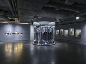
Being taken from one place to another in specific time frames may seem almost authoritarian, but in fact it allowed each area to be experienced to at least the same level. When combined with the rule that photography is not permitted at all in the museum’s lowest level, a fuller sense of engagement becomes possible. When you have a certain amount of time and, for half of the spaces, nothing to do except, well, experience them, the distractions that can sometimes accompany exhibitions fall away.
It is strange to note that the section of the museum that allowed phone usage—the upper section—was the one with greater emphasis on sensory experiences. Though this exists across all exhibits, it is in the final rooms where the multiplicity of senses comes into greatest effect. It might seem more logical that this is when your phone should go away (after all, try taking a picture of a smell), though, in retrospect, there is method to this approach.
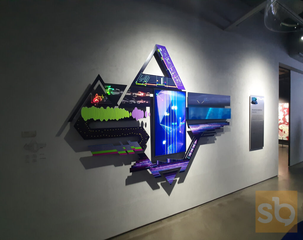
The lower section of the museum, whilst I couldn’t really grasp a definitive theme, is apparently dedicated to simply “exploring the breadth of music in greater depth.” Perhaps the vagueness of this concept was why it was difficult to detect a distinct thread behind everything presented, beyond just “going behind the scenes.” For me, this is a perfect example of where the marketing speak felt the need to make something perfectly exciting seem more poetic: these exhibitions did not need to have depth to be fascinating. Videos of producers explaining their process, complex infographic art explaining the breakdown of famous songs, even cinematograph image series of different groups’ dance practices: there is a lot here just to absorb without the need for a deeper narrative.
Perhaps the closest to this desired depth is in the huge, wall-length screens projecting different Hybe groups dancing to some of their most distinctive routines. The impact of these come from the deliberately mismatched music, with the accompanying labels encouraging viewers to see these songs from new angles through the new rhythms and melodies. This is certainly intriguing: BTS’ lyrical “Black Swan” dance particularly resonates when put in this new context. This moment is the most playful in terms of what music is, and the best any of the exhibitions gets at addressing the concept of music’s power.
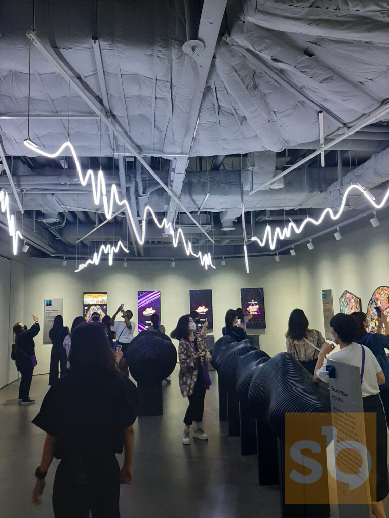
Passing into the upper section of the space, via a delightful James Jean BTS illustration exhibition, the multi-sensory element of Insight really comes into full force. Whilst incorporating all five senses in an exhibition might sound bizarre at best, like something out of Willy Wonka’s chocolate factory, the overall result is impressive and entertaining. Sound and sight are obviously the most prominent senses, and the use of music that plays when you stand in specific areas, as well as exhibition cases that use mirrors and digital footage to manipulate what you see, is enjoyable. Tiny dioramas of Hybe artist videos and sequences of bells chiming “Spring Day” are even more unique ideas, and the enhancement of these displays with set design mimicking soundwaves was another satisfying touch.
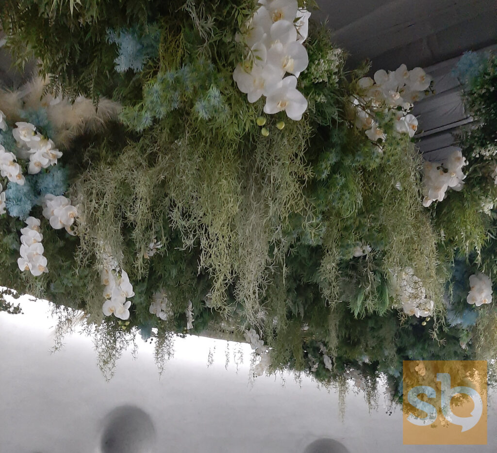
However, it’s moments like the motion-capturing cameras that allow the participant to play with digital effects as they dance, or the wall of “Euphoria” scent accompanied by cascading flowers, that are the most unexpected. These experiences are so inherently physical–the scent wall requires you to put almost your whole head in a scented niche—that they provide the biggest surprise, in comparison to the typical passive experience of a visual art exhibition. There are other interactive moments that are more standard to museum visits here too (audio descriptions through headphones, interactive touch-screen games), and, in combination with these greater pushes for sensory experience, these also elevate to a more entertaining level.
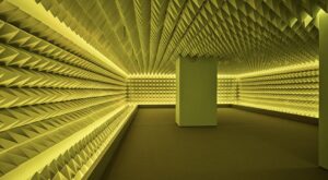
The final curated sections of the museum are the ones most clearly designated to address the concept of “the power of music”, though this is not really fully achieved. After a quick interlude in a fully insulated room designed to block out all sound—in which we are invited to meditate in very brief silence—the final stage of the exhibit takes place sat down in a room where three of the walls are giant screens. These screens are filled with Hybe artists talking-head interviews, explaining why they love their work and what it means to them.
This is clearly meant as an emotional core to the experience, but is such an about turn from the near whimsy of the previous sensory displays that it falls slightly flat. As much as the interviews are sincere and interesting, it doesn’t feel like anything these artists haven’t expressed before, and nothing new is revealed. If this is how Hybe wanted to express music’s emotional power, this was a remarkably uncreative way to do it, given what has come before.
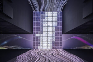
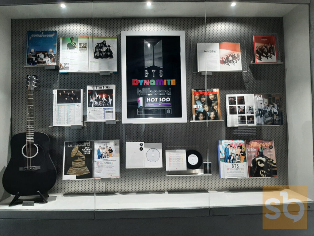
Another earlier exhibition moment makes an even blunter interpretation of what music’s power is, here taking it to be the literal power of winning awards. On the lower level of the exhibition, the attendees are ushered in to a large room, the left side of which is a huge wall of shelves, filled with awards won by Hybe artists. This is displayed alongside video imagery on the walls and floor of different groups winning these awards and making their speeches.
Of course, as a BTS fan, there was a deep satisfaction in seeing all these awards displayed so proudly, though it is worth noting that all other Hybe artists (Nu’est, Seventeen, TXT, GFriend, and Enhypen) get good representation too, as they do across the museum. As an exhibition attendee, this felt like a statement of bravado, though not in a negative way. As emphasised by the light patterns projected onto the floor under us and across the walls, the vibe was clearly intended as celebratory, and this comes across. Ironically, this felt, in its simplistic way, like a greater statement of power than the attempted emotional hit in the exhibition’s final moments.
As an overall museum experience, Hybe has presented another dynamic, finely-tuned product that entertains effortlessly. Laying out a clear flow whilst not becoming a guided tour is an achievement in itself, and Insight is truly a space where visitors can get to grips with music through the five senses. Whilst the exploration of music’s power felt, personally, too shallow to have impact, I would argue that this need for layering and depth wasn’t really important. Engaging in the exhibition in such a full way, often without phones and with the opportunity to use different parts of our bodies, was enough to make this significant. Hybe Insight may, ironically, not actually give audiences any greater insight than any of their other media has done into what makes the work of their artists so appealing. But it managed to do what these artists do anyway: entertain through well-executed concepts and experiences.
(Hybe Insight, NME, YouTube. Images via Sarah Vickery, Hybe, Korea Times and Korea Joongang Daily)
