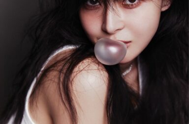
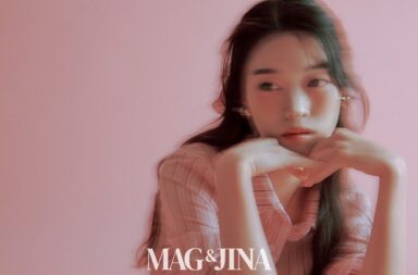
Welcome back to another installment of For Your Viewing Pleasure where we take time out of the week to curate a set of photos from the K-pop landscape.
Pictorials today rarely consist of color pop in the true sense of the phrase, but they do incorporate splashes of color on dull backgrounds instead of the original monochrome. Primary colors like red and yellow are the go-to shades for this avante-garde use of contrast. Accessories and make-up seem to bring out this dichotomy most effectively. The following photographs accentuate the two worlds of the dark and the bright in the best sense.


 | Perfect Velvet")


 | Elle")
 | InStyle")
 | CeCi")
(Images via Elle, Esquire, Cosmopolitan, InStyle, CeCi, Harper’s Bazaar, SM Entertainment)